
Accessible HTML Email: A Practical Guide to Emails Everyone Can Read
Here's an uncomfortable truth about the email you shipped last week: some of your subscribers couldn't read it. Not because it landed in spam, and not because it broke in Outlook — but because a screen reader announced it as a meaningless jumble of table cells, or because your on-brand grey-on-white body copy fell below the contrast threshold a low-vision reader needs. The World Health Organization estimates that around one in six people globally lives with a significant disability. Those people are on your list, and email accessibility is what decides whether your message actually reaches them.
The good news: accessible email is mostly a set of habits, not a rewrite. Many of the same techniques that make an email work for assistive technology — semantic structure, strong contrast, real text instead of text baked into images — also make it render better across clients, survive image blocking, and adapt to dark mode and small screens. This is a practical, code-level walkthrough of the changes that matter most, roughly in the order you should apply them. If you build on top of solid responsive HTML email templates, most of this slots straight in.
Why Accessibility Is an Email Problem, Not Just a Web Problem
On the web, accessibility has had two decades of standards, tooling, and legal pressure to mature. Email lags badly. The rendering engines are more fragmented, the layout is still built on tables, and most ESP templates were never designed with assistive technology in mind. That combination means the average marketing email is less accessible than the average web page — a screen reader user navigating a typical promotional email often hears a wall of "table, row, cell, blank, blank" before reaching any actual content.
There's also a business case that's easy to miss. Accessible emails degrade gracefully: they stay readable when images are blocked, when the text is resized, when the client forces its own dark theme. So the work you do for the screen reader user quietly improves the experience for the commuter reading on a cracked phone in bright sunlight, too. Accessibility and robustness are the same investment.
Start With Real Structure: Presentation Tables and Semantic Content
Email layout is built with tables — that's not going away, because it's the only reliable cross-client layout mechanism. The problem is that screen readers try to interpret every table as a data table, announcing its dimensions and reading it cell by cell. When the table is really just there to position a logo next to a headline, that's pure noise.
The fix is one attribute. Mark every layout table as presentational so assistive technology skips its structure and reads the content inside as normal flow:
<table role="presentation" cellpadding="0" cellspacing="0" border="0">
  <tr>
    <td>...</td>
  </tr>
</table>
Then use real semantic tags for the actual content. Headings should be genuine <h1> through <h3> elements, not <span>s styled to look big — screen reader users navigate by heading, and a document with no headings is a document with no signposts. Body copy belongs in <p> tags, lists in <ul> and <ol>. One <h1> per email, describing the core message, gives every reader — assistive or not — an instant sense of what they're looking at.
Set the Language and a Descriptive Preheader
Two small additions punch above their weight. First, declare the document language on the root element so screen readers use the correct pronunciation engine:
<html lang="en" xmlns="http://www.w3.org/1999/xhtml">Without lang, a reader set to French may attempt to pronounce your English copy phonetically in French — comprehensible to no one. Second, write a real preheader (the hidden preview text pulled into the inbox summary). It's the first thing announced, so make it a meaningful sentence, not leftover boilerplate. Keep it visually hidden but available to the reader rather than stripped out entirely, and never leave it as the default "View this email in your browser."
Write Alt Text That Actually Helps
Every informative image needs alternative text that conveys what the image communicates — not a filename, and not a keyword dump. If a hero image says "50% off, this weekend only," the alt text should say that, because for a screen reader user (and for anyone whose client blocks images) the alt text is the image. Ask yourself: if this image vanished, what would the reader need to know? That's your alt text.
The counterintuitive part: decorative images should have empty alt text — alt="", present but blank. A spacer, a divider flourish, or a background texture carries no information, and an empty alt attribute tells the screen reader to skip it silently. Omitting the attribute entirely is worse: some readers will then read out the image URL. So the rule is binary — describe it meaningfully, or mark it empty.
Get Your Color Contrast Above the Line
Low contrast is the single most common accessibility failure in email, and it's entirely preventable. The Web Content Accessibility Guidelines set the widely-adopted bar: body text needs a contrast ratio of at least 4.5:1 against its background (level AA), and large text — roughly 18pt, or 14pt bold — needs at least 3:1. The stricter AAA level asks for 7:1. That trendy light-grey-on-white caption almost certainly fails, and so do plenty of "brand color" buttons with white labels.
You don't have to guess. WebAIM's free Contrast Checker lets you paste a foreground and background color and instantly tells you the ratio and whether it passes AA and AAA for normal and large text.
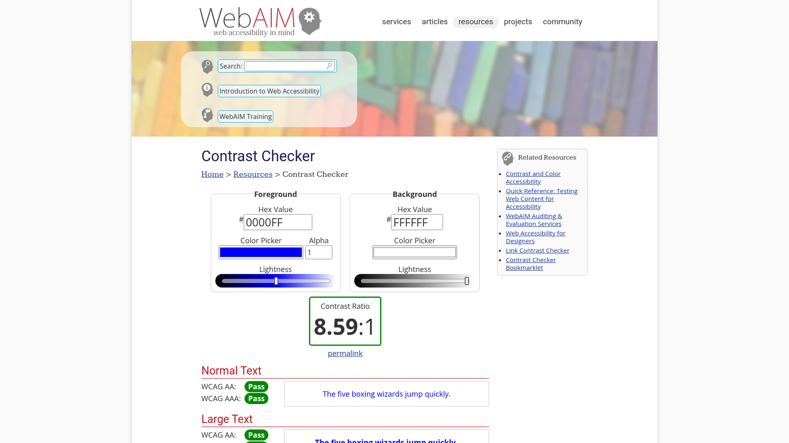
Check your body text, your links, your button labels, and — critically — your footer, where the unsubscribe link and legal text so often disappear into pale grey. If a color pairing fails, darken the text or lighten the background until it passes. It's a two-minute fix that changes who can read you.
Never Rely on Color Alone
Related to contrast but distinct: don't use color as the only way to convey meaning. A link that's distinguished from body text purely by being a slightly different shade is invisible to a colorblind reader — and roughly 8% of men have some form of color vision deficiency. Underline your links, or make them unmistakably bolder. If you flag a sale price in red, pair it with a word like "Sale" or a strikethrough on the old price. The information should survive being rendered in greyscale.
Know the Standard You're Building Toward
Email has no accessibility law of its own, so the industry borrows the web's. WCAG 2.2 — the current W3C Recommendation — is the reference point, and its success criteria map cleanly onto email: 1.4.3 (contrast), 1.4.4 (resize text without loss of content), 1.4.5 (avoid images of text), and 1.3.1 (info and relationships, i.e. real semantic structure) are the ones you'll hit most often.
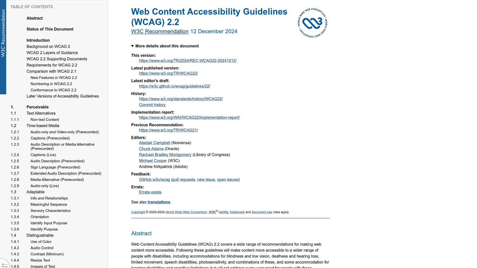
You don't need to memorize the spec. Treat it as the "why" behind the checklist: when someone asks why a caption needs 4.5:1 contrast or why the CTA can't be an image, the answer is a specific, referenceable success criterion, not a matter of taste.
Type Size, Tap Targets, and the Trap of Text-in-Images
Three layout-level habits matter for readers with low vision or motor impairments:
- Body text at 14px minimum, 16px ideally. Anything smaller is a strain, and iOS Mail will auto-zoom text under about 13px, breaking your careful layout. Set a comfortable base size and let the design breathe.
- Tap targets at least 44×44px. A link or button that's a thin line of text is nearly impossible to hit for someone with a tremor or on a moving train. Give buttons generous padding so the tappable area is large. (WCAG 2.2's minimum is 24×24px; 44px is the friendlier, widely-recommended target.)
- Don't bake body text into images. Text inside a JPG or PNG can't be read by a screen reader, can't be resized, can't be recolored for dark mode, and vanishes entirely when images are blocked. Keep text as live HTML text. Reserve images for actual imagery — this is WCAG 1.4.5 in practice, and it's also just more robust email.
Mind the Reading Order
Screen readers read source order, top to bottom — not the visual order your CSS produces. If you use alignment or absolute-ish tricks to make a column appear on the right while it sits first in the HTML, a screen reader user hears it first. The safest structure for accessibility is also the safest for mobile: a single-column layout where source order and visual order are identical. When you do stack columns, make sure the HTML order tells the story correctly on its own, because that's the order assistive technology will narrate.
Dark Mode Is an Accessibility Feature
For many people with light sensitivity or certain visual conditions, dark mode isn't an aesthetic preference — it's what makes reading comfortable or even possible. An email that inverts into an unreadable mess in dark mode (black logo disappearing on a dark background, low-contrast text getting worse) is failing those readers specifically. Handling dark mode deliberately, rather than letting each client force its own inversion, is part of accessible design. Our guide to dark mode email design covers the techniques; treat it as a sibling of this checklist, not a separate concern.
Test It — With Tools and With People
Accessibility can't be eyeballed from the design comp. Automated tools catch a large share of issues fast: WAVE, from WebAIM, evaluates a page for accessibility problems — missing alt text, low contrast, structural issues — and shows them inline. You can render your email as a standalone HTML page and run it through WAVE to catch the obvious failures before you send.
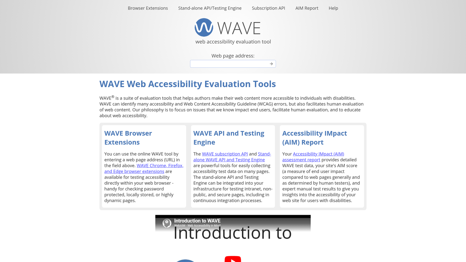
But automation only goes so far. It can tell you an image lacks alt text; it can't tell you the alt text is unhelpful. The real test is turning on a screen reader — VoiceOver on macOS or iOS, NVDA on Windows — and listening to your own email. It's humbling the first time, and it's the fastest way to internalize what good structure sounds like. Pair that with cross-client rendering checks so you know the accessible markup you wrote actually survives in Gmail, Outlook, and Apple Mail; tools like Postdrop.io let you preview across clients in the browser, and our guide on testing HTML emails before sending folds accessibility checks into a normal pre-send routine.
Bottom Line
Accessible email isn't a specialist discipline bolted on at the end — it's a handful of defaults that, once they're in your template, cost you nothing per send. Mark layout tables as presentational and use real headings. Set the language and a meaningful preheader. Write alt text that carries the image's meaning, and blank it for decoration. Clear the 4.5:1 contrast bar, and never lean on color alone. Keep text as text, size it generously, and make buttons easy to hit. Then test with WAVE and with an actual screen reader. Do that, and you stop quietly losing one in six of your subscribers on every campaign — while shipping email that's more robust for everyone else, too.
References: the WCAG 2.2 specification from the W3C, WebAIM's Contrast Checker, and the WAVE evaluation tool. Internal: our guide to dark mode email design, the complete guide to responsive HTML email templates, and how to test HTML emails before sending.